anchorThe idea
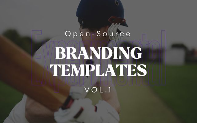
Among the fields I have experience in, Branding and UI/UX seemed the best choice for starting a new open-source project. The idea came quickly: I decided to create Branding and UI/UX Templates for fellow designers. In the past months, I have dedicated one day of my work week, my "20% time", to the conception and realization of this project and I will be showcasing the results in this post.
anchorThe journey & experience
After getting used to rules and requirements, at first it felt kind of strange to have all the freedom of the world - I can do anything I want as long as the results are interesting and motivating for others.
At this point, I had a voice in my head - that most of the designers would hear I assume - "Let’s imagine a fictional client or project that I have to find a solution for". Instead of this, I thought: "What if I turn the whole process upside down and create something based on my gut feelings, combining surprise elements together and see what comes out? "
The first concept quickly turned boring and I started feeling a bit skeptical about my idea. But instead of giving up, that brought me closer to what I really wanted. Extraordinary. Surprising. Anything but boring.
anchorConcept 2

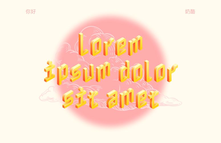
I was searching among Google fonts when I found the most ridiculous but well-designed font I've ever seen, called "Nabla". I knew I had to start something with it. I don’t think I would ever suggest using a similar font to a client in a real-world situation, so this project was the perfect opportunity to experiment with it.
Here things became interesting: I started to combine the font with captivating cloud illustrations, focusing on using soft and warm color tones while maintaining the balance with the Circular Std font, which has a strong geometric typeface.
Based on the overall impression I was getting from the design, I decided to use some professional Chinese street photography. It was hard to find exactly what I was looking for, but after hours of searching through seas of stock photos, I finally came across the perfect pictures for this project. These naturally led me into trying some traditional Chinese typography (which I never did before). It was very satisfying and lots of fun.
I'm quite happy with the overall result and I believe it would look great for a fashion brand with a young target group within the Chinese market, or any other market with a strong connection to China.
anchorConcept 3

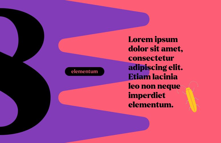
Berlin is a costant inspiration for creative people. Even a poster on the street can turn into something great: this is how Concept 3 was born. I decided to play around with brutal geometric shapes and patterns, with strong but not too saturated colors.
The Larken font immediately seemed a good fit here. I remembered this font from the past work: it is a very special bohemian font, between modern and classic, elegant and crazy. The brutal geometric shapes required some smaller details for balance so I found a package with some interesting bugs illustrations which I modified to make them symmetrical and complement the concept better.
This idea has a quite versatile usage and of course the illustration package can be changed to match specific contexts.
anchorConcept 4

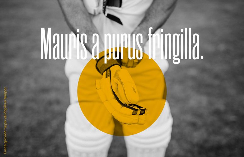
Extremely condensed fonts were always something I wanted to try on the web but never had the chance to. Concept 4 seemed just the perfect time to experiment with them. After finding the ‘Rama Gothic C’ font which I considered the best designed in this category, I started to test different concepts. My idea quickly turned into a slideshow-style website combining colorful surfaces with typography playfulness, and wonderful monochrome photography with center-aligned overlay color circles, highlighting important parts of the image.
anchorConclusion
It was very valuable for me to experience the freedom of creating Branding templates without any rules or requirements and it has surely motivated me to suggest braver and more outstanding elements in real-life projects as well. I hope these templates will be just as useful and fun to work with - or implement further - for the designer community, as it was for me to create them.

